

Store Decoration is a tool that allows sellers to personalize and design their own store homepage, resulting in an unique interface and layout that attracts customers.
Who should use store decoration tool?
Sellers should use store decoration tool to maximize selling capability.
Benefits of using store decoration tool
Enhance visitors to the page.
Display promotions and best selling products in order to increase attractiveness and reinforce product visibility.
Stand out from your competitors
Allow custom decoration and create a unique layout to attract customers.
Higher conversion rate for decorated stores
Let’s Increase revenue from now on by using a store decoration feature as instructed below!
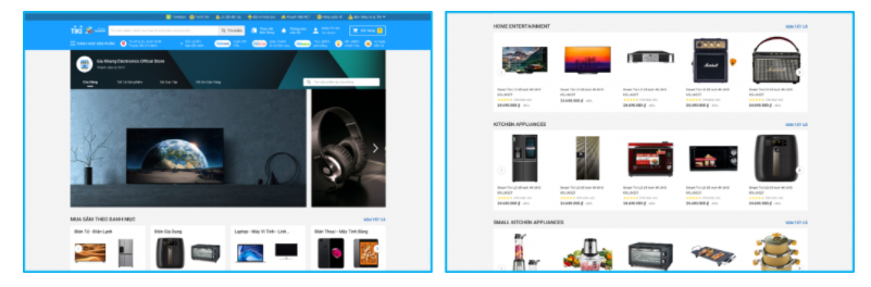
Store page on website interface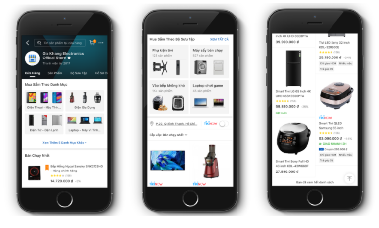
Store page on app interface
Step 1: Go to Seller Center and select Store design from the drop-down menu.
Step 2: Select Store decoration
Step 3: From this screen, the Seller may begin the installation by selecting either the Mobile or PC version. After selecting Save, the widget settings will be modified for the rest of the version. During installation, sellers can view two variations of the store’s actual display.
Note: Once the widgets have been installed, you must click Publish for your store’s interface to appear on the Tiki app and website.
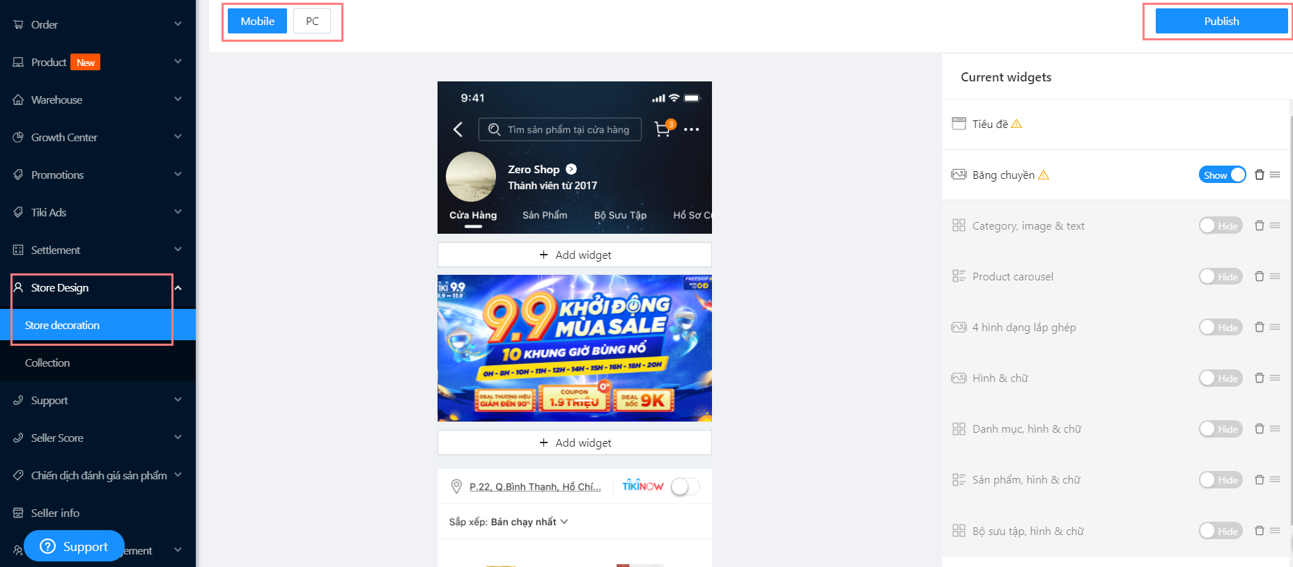
The preview template for Mobile interface
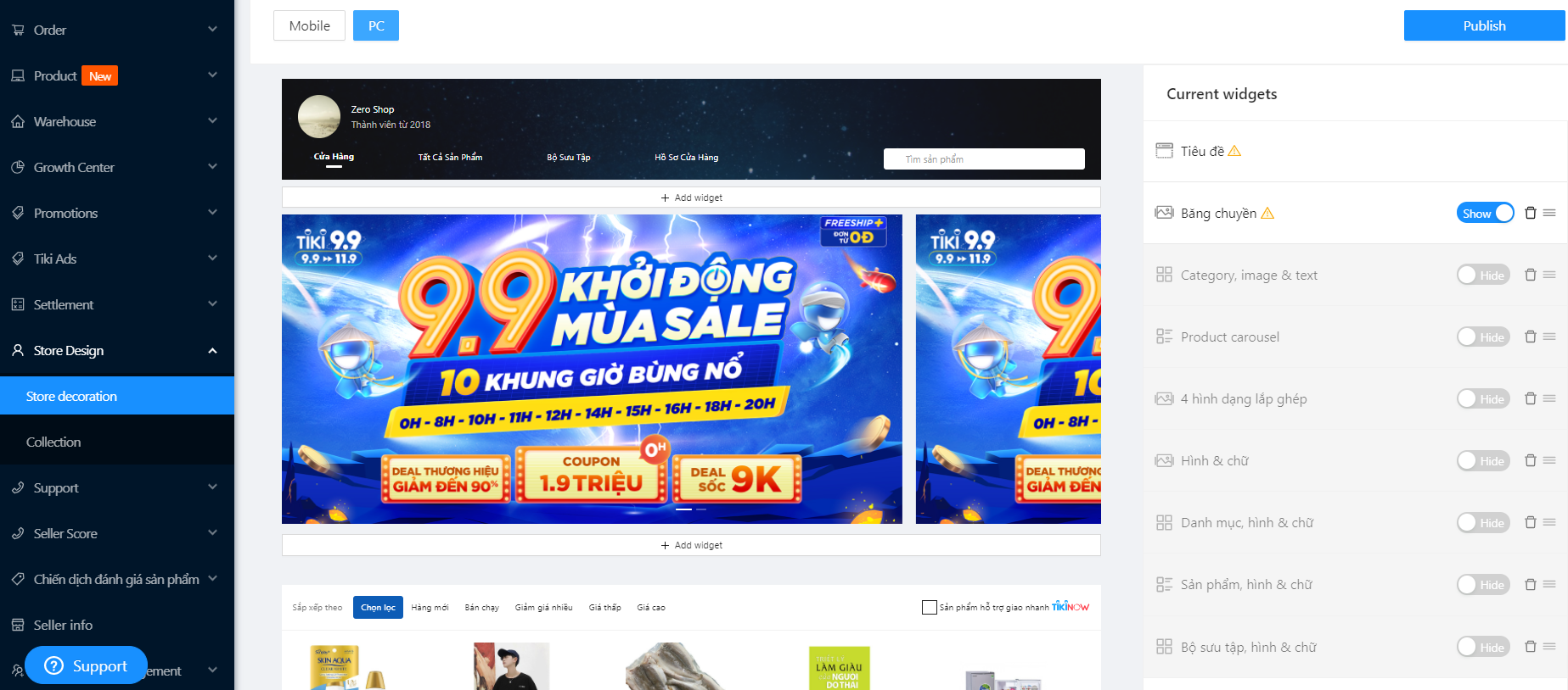
The preview template for PC interface
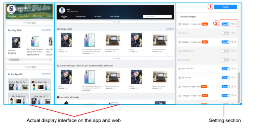
Store decoration tool includes 5 main parts:
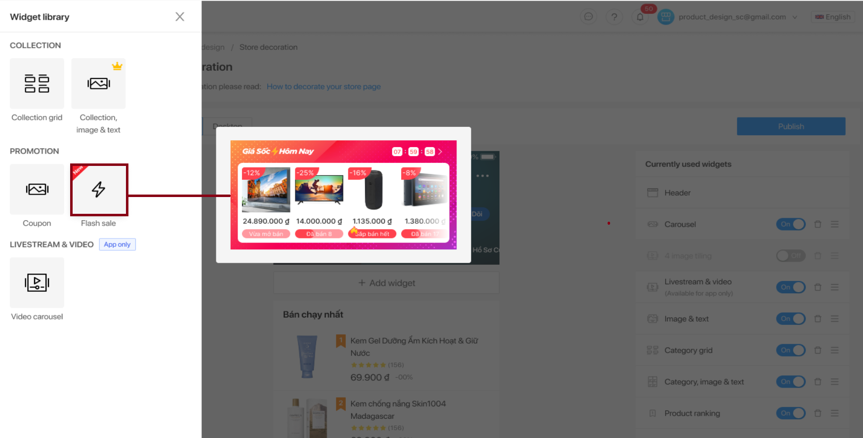
1. Widget library
Where all available widgets are listed. Sellers view and add designs to the preview template.
2. Preview: The place to display the design at the customer’s interface.
3. Current widgets
Where to list all the respective widgets as on Preview. Sellers can hide/show/delete/reorder (except the header).
Show/Hide icon: sellers are able to choose Hide/Show widget by clicking it.
Three stripe icon: sellers are able to reorder widgets’ position by clicking and dragging them to a desired position.
Trash icon : Sellers are able to remove the widget by clicking it.
4. Widget in detail
When clicking on each widget in the Current widgets, the widget details will be displayed for the Seller to install.
Widget details consist of 4 parts:
Widget Name – Seller can customize the widget name as you like
Preview different layouts in the same widget type
Widget settings
Click Save/Cancel
5. Publish: When sellers choose Publish, all settings in widgets configured by sellers shall be updated in the system and displayed in customer facing screen (Tiki app and website).
General setting
1. Select Add widget in the preview: The system will display a table of Designs on the left side of the screen for Seller to choose the widget style.
2. Seller clicks on the desired widget style and starts the installation. Remember to click Save to apply your settings.
Note:
A widget type can be added many times. A Seller, for example, can have two carousel banner widgets, three product rating widgets, and so on.
You can add up to 15 widgets to the Current widgets, however only 10 widgets (Show status) can be displayed on the store. To make your store more appealing, you should select the appropriate number of widgets.
If the Current widget already has 10 widgets in show mode, even though the maximum limit of 15 widgets has not been reached (due to the default display mode when adding any widget), please hide the widget. To be able to install a new widget, you must first remove an existing widget.
3. Click Publish after all widgets have been installed.
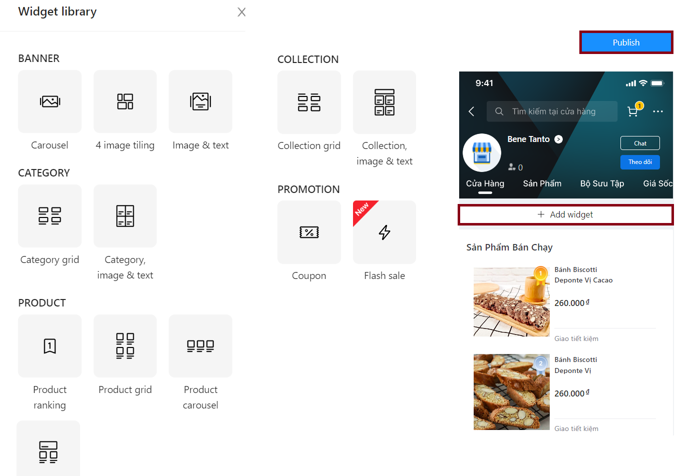
There are 6 main types:
|
Widgets |
Designs |
|
Banner |
|
|
Category |
|
|
Product |
|
|
Collection |
|
|
Promotion |
|
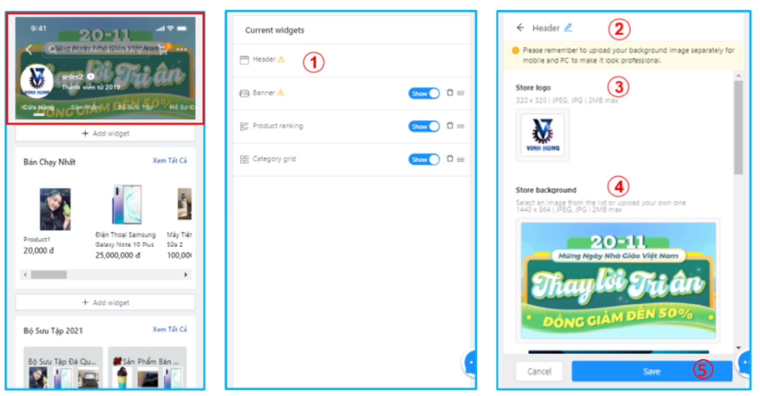
1. TIÊU ĐỀ WIDGET (HEADER) – SYSTEM DEFAULT WIDGET
Header widget is fixed at the top of the store page, therefore, sellers are not able to add/remove/hide/reorder this widget. This widget is not listed in the widget library, either, yet is shown at the Current widgets table on the right hand side.
Note: Header image size displayed on mobile is different from PC, Sellers need to set up each interface to match with system requirements.
Step 1: Select Header
Step 2: Widget name: Sellers are able to name the widget to manage
Step 3: Click on Logo to upload a new image
Note: Image must satisfy all criteria: 320×320; JPEG, JPG; and maximum 2MB
Step 4: Click on Image to upload a new background
Note: Image must satisfy all criterias: 818 x 496 for mobile and 1440 x 180 for PC; JPEG, JPG; and maximum 2MB
Step 5: Click Save to save settings
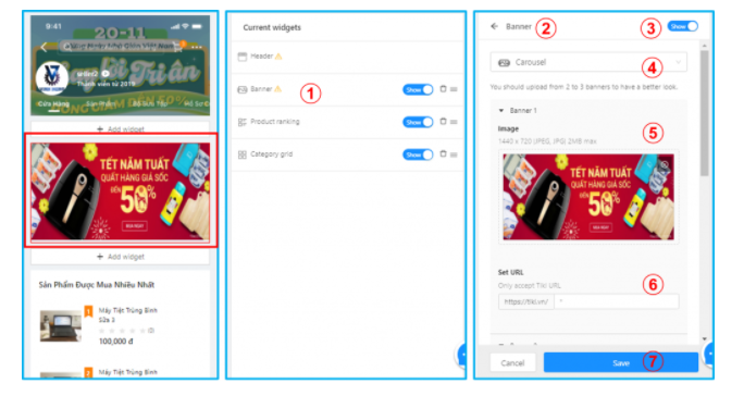
2. BANNER WIDGET
a. Banner carousel
Sellers may easily add a title and description to each banner picture and use this banner style to advertise specials, collections, goods, and so on.
Step 1: Select Banner from Widget library
Step 2: Widget name: Sellers are able to name the widget to manage
Step 3: Show/Hide Button: Sellers are able to select show or hide the widget by clicking on it
Step 4: Select displayed form: currently the system only provides carousel for this widget
Step 5: Click image to upload a new one
Note: Image must satisfy all criterias:1440 x 720; JPEG, JPG; and maximum 2MB
Step 6: Link: sellers are able to insert an internal (Tiki) link for each image.
Step 7: Click Save to save settings
Note:
Banners are uploaded up to 3 images
Banners are automatically displayed horizontally
Banner images must be followed Tiki standards
b. Image & text banner
Step 1: Choose Image & text banner from Design Template
Step 2: Widget name: Click on the pen icon to name the widget.
Step 3: Show/Hide Banner button: Seller can choose to show banner or not show banner.
Step 4: Choose a display style: Sellers can choose from 3 widget styles for the banner here to preview the designs: Carousel, 4 image tiling, Image & text.
Step 5: Click Upload new photo to upload photos. Size: 1440 x 720; format: JPEG, JPG and up to 2MB. Sellers can upload up to 6 images for this widget.
Step 6: URL: Sellers can insert Collection link or product link on Tiki.
Step 7: Title: As a required component, it should be structured in such a way that it is appealing to visitors. A maximum of 50 words are permitted.
Step 8: Description: Sellers can use up to 100 characters to explain the offer, collection, or product being advertised on the banner.
Step 9: Text & Background Color: Sellers choose the text color and background color for the Title and Description. Take note of the usage of harmonizing and attractive colors to attract viewers.
Step 10: Click Save to apply.

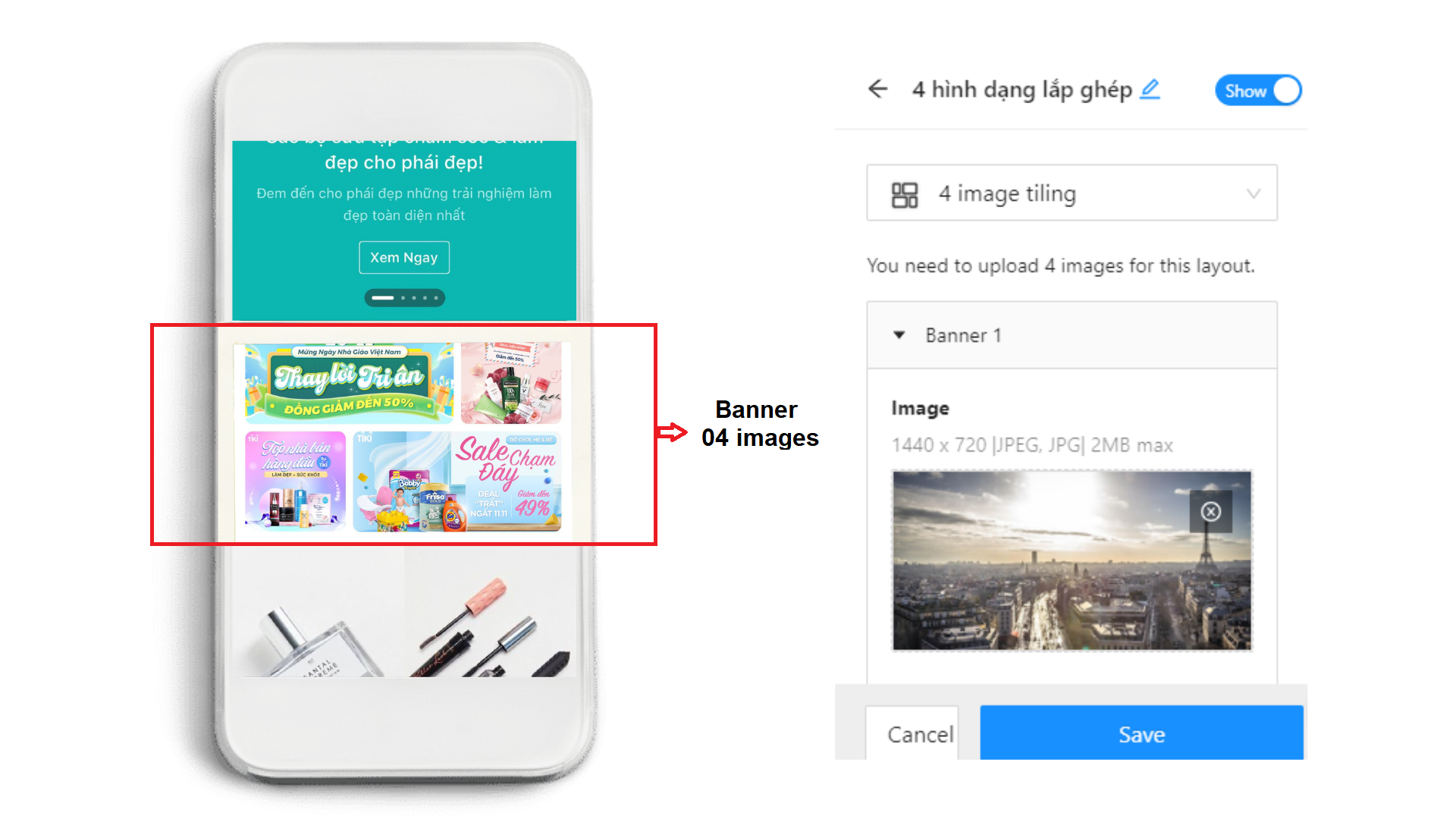
c. 4 image tiling
Step 1: Choose Image & text banner from Widget library
Step 2: Widget name: Click on the pen icon to name the widget.
Step 3: Show/Hide Banner button: Seller can choose to show banner or not show banner.
Step 4: Choose a display style: Sellers can choose from 3 widget styles for the banner here to preview the designs: Carousel, 4 image tiling, Image & text.
Step 5: Choose Upload new photo to upload photos. Size: Banner 1 and Banner 4: 1440 x 720 and Banner 2 and Banner 3: 1440 x 1440.
Step 6: URL: Sellers can insert Collection link or product link on Tiki.
Step 7: Click Save to apply.
3. CATEGORY WIDGET
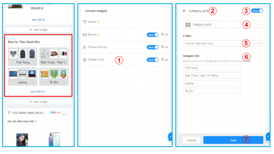
a.Category grid
Step 1: Select Category grid from Widget library
Step 2: Widget name: Sellers are able to name the widget for easier management.
Step 3: Show/Hide Button: Sellers are able to select show or hide the widget by clicking on it.
Step 4: Choose a display style: currently the system only provides a grid style for this widget.
Step 5: Title: Type title for this widget.
Step 6: Select category (up to level 4) from drop-down list.
Note: select maximum 4 categories.
Step 7: Click Save to apply.
Shop by category interface
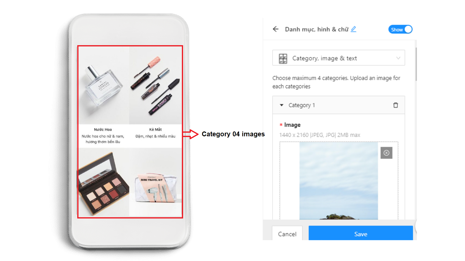
b. Category, image & text
Step 1: Choose Category, image & text banner from Widget library.
Step 2: Widget name: Click on the pen icon to name the widget.
Step 3: Show/Hide Banner button: Seller can choose to show banner or not show banner.
Step 4: Choose a display style: Sellers can choose from 2 widget styles for the banner here to preview the designs: Category grid; Category, image & text.
Step 5: Choose Upload new photo to upload photos, each photo will represent the category that you want to display. Size: 1440 x 2160, format: JPEG, JPG and up to 2MB.
Step 6: Select category: select maximum 4 categories.
Step 7: Description: Sellers can use up to 50 characters to explain the offer, collection, or product being advertised on the banner.
Step 8: Click Save to apply.
4. PRODUCT WIDGET
Using this widget, you can advertise the products in different product collections available in your store.
a. Product grid/Product ranking/Product carousel
Step 1: Select Product grid/Product ranking/Product carousel from Widget library
Step 2: Widget name: Sellers are able to name the widget for easier management.
Step 3: Show/Hide Button: Sellers are able to select show or hide the widget by clicking on it.
Step 4: Choose a display style: At the product widget, you can select and preview the display styles:
Note: Each style will have a different display as below:
Product Ranking: Vertical Display
Product grid: Displayed in grids
Product carousel: Horizontal display
Step 5: Title: Type title for this widget (Ex: Best seller, Hot deal,…). The title will be displayed on the Store interface.
Step 6: Select the product collection to display. The system will automatically show the goods in that Collection following the sorted order in the Collection.
Step 7: Click Save to apply.

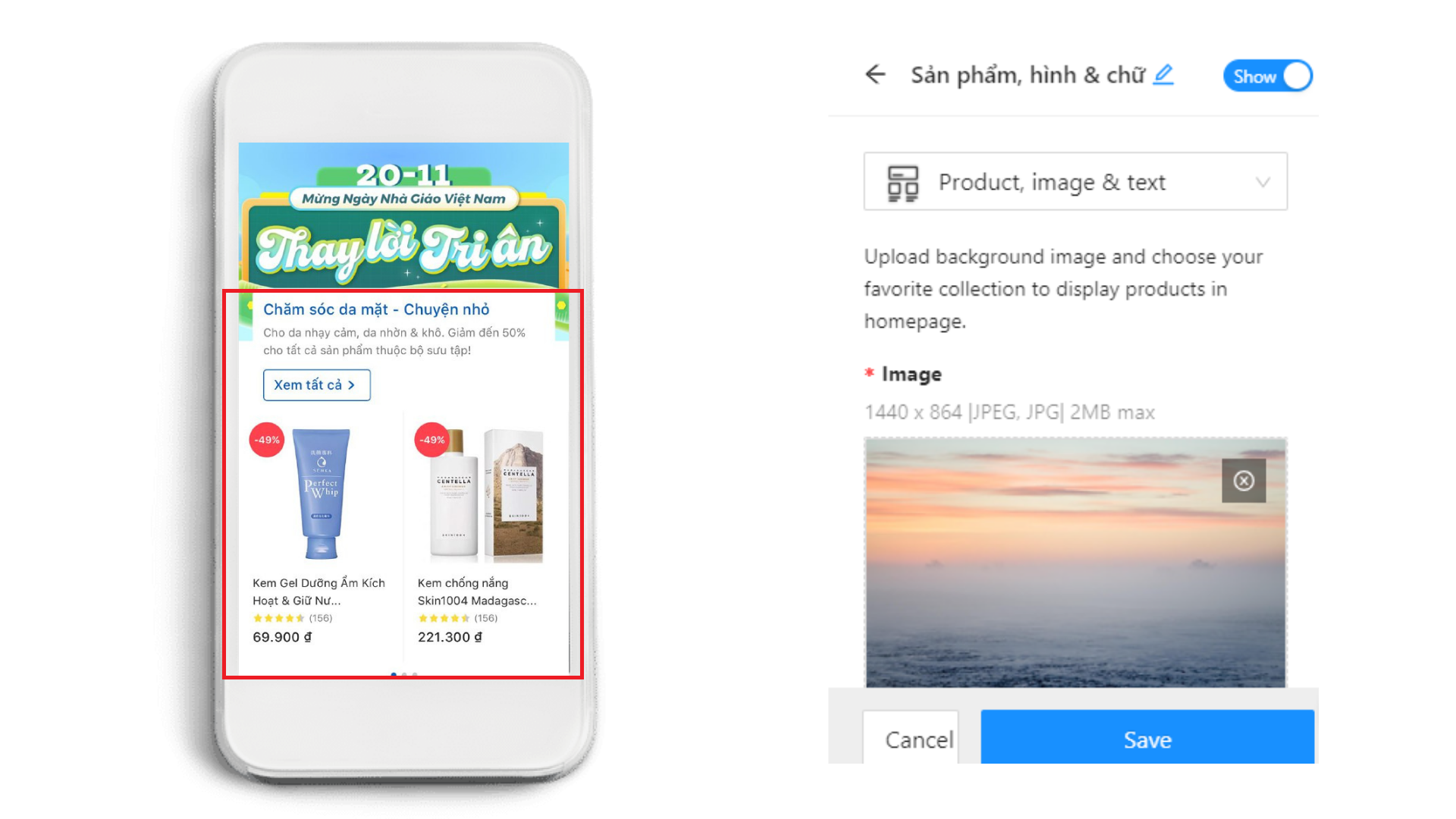
b. Product, image & text
Step 1: Select Product, image & text from Widget library
Step 2: Widget name: Sellers are able to name the widget for easier management.
Step 3: Show/Hide Button: Sellers are able to select show or hide the widget by clicking on it.
Step 4: Choose a display style: Sellers can choose from 4 widget styles for the banner here to preview the designs: Product ranking; Product grid; Product carousel; Product, image & text.
Step 5: Choose Upload new photo to upload photos. Size: 1440 x 864, format: JPEG, JPG and up to 2MB.
Step 6: Collection: Below the selection box, sellers can choose an existing collection in their store or create a new one.
Note: In this widget, the system will only show the top 10 products from the collection.
Step 7: Title: The system will use the collection’s available title automatically. You can edit the title here if you want to, but you should pick a catchy title to attract customers. Title must be up to 50 characters.
Step 8: Description: This is an optional section, but the Seller should fill it out completely so that the Customer understands the collection quickly. The system will automatically fill in the collection’s available description; the Seller must check the content for appropriateness and up to 100 characters.
Step 9: Click Save to apply.
5. COLLECTION WIDGET
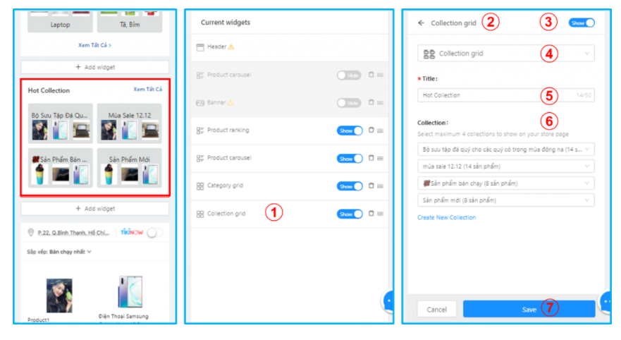
a. Collection grid
Step 1: Select Collection grid from Widget library
Step 2: Widget name: Sellers are able to name the widget for easier management.
Step 3: Show/Hide Button: Sellers are able to select show or hide the widget by clicking on it.
Step 4: Choose a display style: currently the system only provides a grid style for this widget.
Step 5: Title: Type title for this widget. The title will be displayed on the Store interface.
Step 6: Select the product collection to display. Note: You can only choose up to 4 collections of products. If you don’t have any available collection, you can create a new one.
Step 7: Click Save to apply.
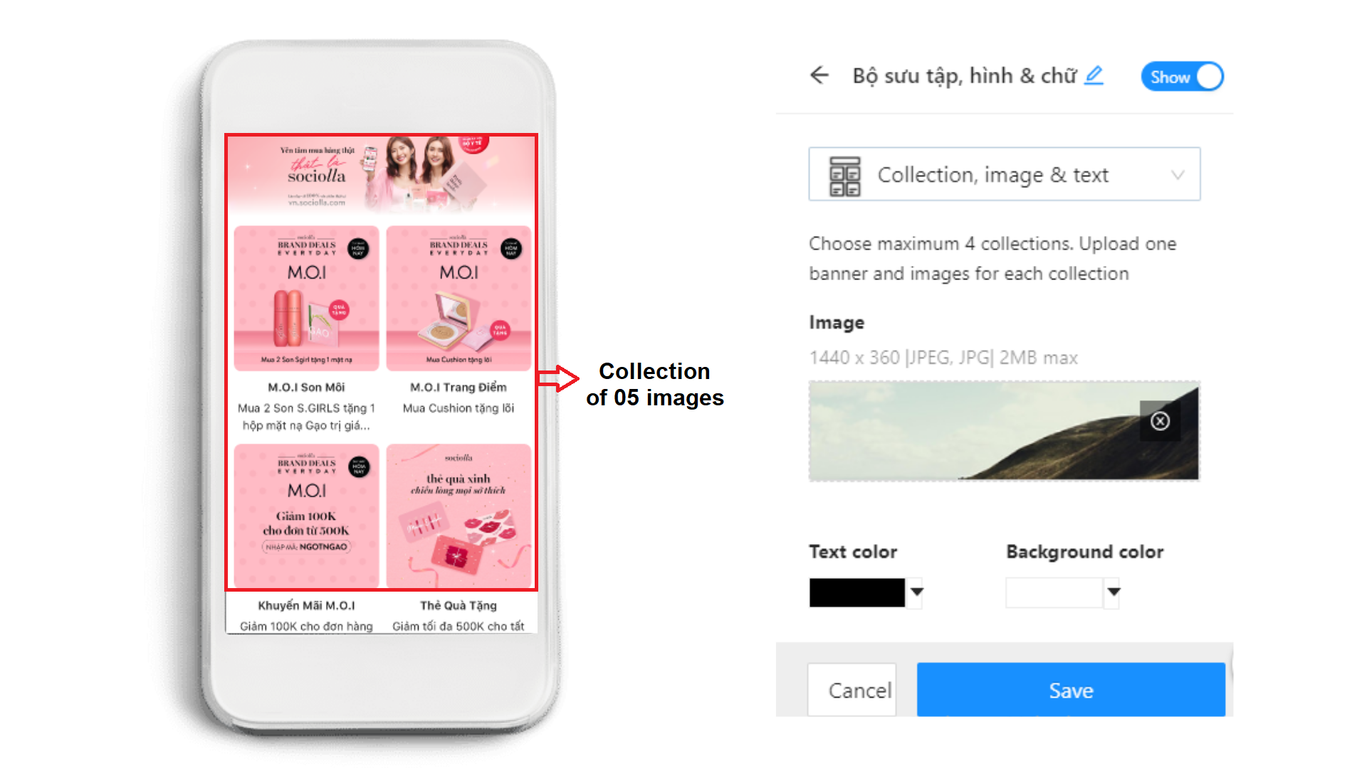
b. Collection, image & text
Step 1: Select Collection, image & text from Widget library
Step 2: Widget name: Sellers are able to name the widget for easier management.
Step 3: Show/Hide Button: Sellers are able to select show or hide the widget by clicking on it.
Step 4: Choose a display style: Sellers can choose from 2 widget styles for the banner here to preview the designs: Collection grid; Collection, image & text.
Step 5: Choose Upload new photo to upload photos, each photo will represent the collection that you want to display You can choose the banner from promotion campaigns or product introduction. Size: 1440 x 360, format: JPEG, JPG and up to 2MB.
Step 6: Text & Background Color: Sellers choose the text color and background color in this widget.
Step 7: Collection image: This is the collection’s representative image. Size: 1440 x 1440; format: JPEG, JPG, and up to 2MB.
Step 8: Collection: The seller can select up to 4 collections.
Step 9: Description: This is an optional part, but the Seller should fill it out completely so that the Customer understands the collection quickly. The system will automatically fill in the blanks with the collection’s available description; the Seller must review the content for appropriateness and the description must be up to 50 characters.
Step 10: Click Save to apply.
6. PROMOTION WIDGET
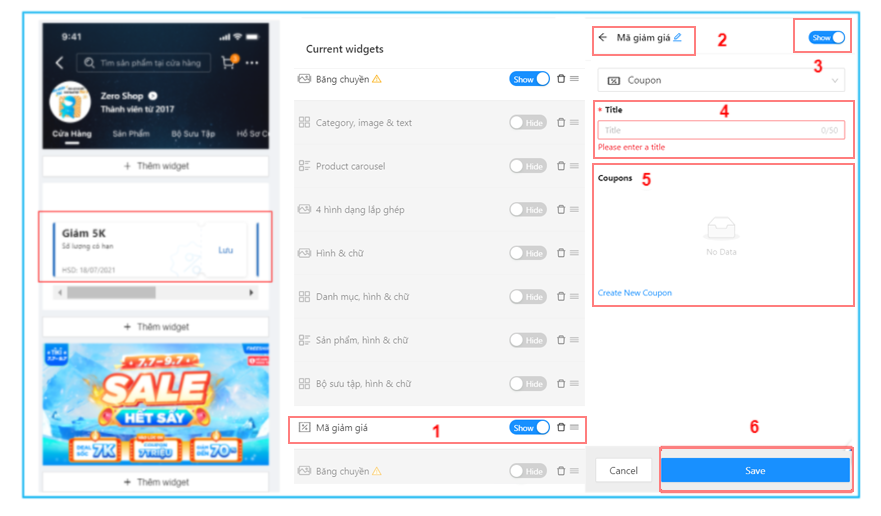
a. Coupon
Step 1: Select Coupon from Widget library
Step 2: Widget name: Sellers are able to name the widget for easier management.
Step 3: Show/Hide Button: Sellers are able to select show or hide the widget by clicking on it.
Step 4: Title: Type title for this widget. The title will be displayed on the Store interface.
Step 5: Display discount codes that are in the enabled status in the store. To create a new discount code, choose Create new Coupon. See instructions for creating a coupon here.
Step 6: Click Save to apply.
b. Flash sale
Displays the products of the seller that have been successfully allocated to participate in the on-going Flash sale promotion.
Step 1: Select Flash sale from Widget library
Step 2: Widget name: Sellers are able to name the widget for easier management.
Step 3: Show/Hide Button: Sellers are able to select show or hide the widget by clicking on it.
The title will be shown on the store’s homepage by default. You are unable to change this title.
Step 4: Click Save to save the settings.

Note:
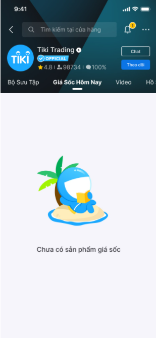
Depending on whether the seller has Flash sale products in effect or not, the widget will be immediately displayed or hidden on the store homepage after the seller clicks Save.
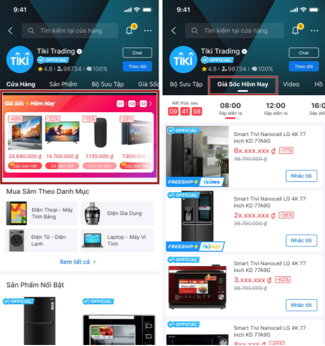
In addition to the established widget, Flash sale products will be featured in the seller’s store at the Giá Sốc Hôm Nay (Today Good Deals) tab.
The store’s homepage with no products registered for the Flash sale
Through some default settings, the system will generate a store for the Seller on the Tiki app and website.

1. Cửa hàng (Store) tab:
Header: Tiki’s default logo and background , store name, joining date
Banner: Not displayed
Shop by category: Default 4 categories (level 1). If sellers have less than 4, the system will show all seller’s categories.
Best selling: Display best selling products.
Shop by collection: Default 4 collections. If sellers have not created collections, this widget shall not be displayed.
All products: Display all seller’s products
The following tags are system defaults that the seller cannot change:
2. Sản phẩm (Product) tab: Display all seller’s categories and products.
3. Bộ sưu tập (Collection) tab : Display all seller’s collections. If sellers do not have collections, this tab would be empty.
4. Giá Sốc Hôm Nay (Today’s Good Deals) tab: Display products that are part of the Flash Sale; if you did not register for this program, the system will not display the information in this area.
5. Hồ sơ cửa hàng (Store profile) tab: Display cancellation rate, return rate, joining date, store description, the number of product.